precision and recall
pr curves
in this post i will cover a pretty boring topic: precision and recall curves (i could have picked something more trendy, but figured the universe already had enough “a beginner’s guide to LSTMs!” posts). the bulk of the post will probably/hopefully be old news to most seasoned ML practicioners, but i’m hoping some tidbits will still be interesting to everyone (e.g. the section on calculating a curve with error bars).
precision and recall (or “PR” for short – not to be confused with personal record, pull request, or public relations) are commonly used in information retrieval, machine learning and computer vision to measure the accuracy of a binary prediction system (i.e. a classifier that maps some input space to binary labels, like “document is relevant” and “document is not relevant”). usually at runtime the classifier assigns a real-valued score to items which can then be thresholded to obtain a binary label prediction. the natural question is how this threshold affects the accuracy characteristics, and this is exactly what a precision recall curve captures.
what are precision & recall curves and how are they related to ROC curves
a PR curve is created by sweeping over classifier score thresholds and calculating the precision and recall at each threshold (these data points trace out a curve in PR space). colloquially, the precision measures “out of all the items my classifier said were positive, how many were correct?”, and recall measures “out of all the positives out there, how many did my classifier say were positive?”
more formally:
- recall (usually the x-axis) = $\frac{TP}{P} = \frac{TP}{(TP + FN)}$
- precision (usually the y-axis) = $\frac{TP}{(TP + FP)}$
where $TP$ is the number of true positives, $FN$ is the number of false negatives, $P$ is the total number of positives (according to ground truth; note that $P = TP + FN$), and $FP$ is the number of false positives.
receiver operator characteristic curves, or ROC curves, are another common way of characterizing binary classifier performance. in fact, they are dangerously similar in that they are easy to confuse, but the difference is important. an ROC curve is also formed by sweeping over score thresholds and calculating two values for each threshold:
- false positive rate (usually the x-axis) = $\frac{FP}{N} = \frac{FP}{(FP + TN)}$
- true positive rate (usually the y-axis) = $\frac{TP}{P} = \frac{TP}{(TP + FN)}$
if you look very closely at the equations, you will notice that true positive rate is the same thing as recall – i.e. the y-axis of the ROC curve is the same as the x-axis of the PR curve. this flip in axes is already confusing, but to make matters worse, the other axes are very different. judging solely from their names, one may think that precision and false positive rate are compliments that should add up to 1.0, but this is not the case.
let’s define some useful functions, and plot a PR curve and an ROC curve for some synthetic data.
%matplotlib inline
import numpy as np
from matplotlib import pyplot as plt
from mpl_toolkits.mplot3d import Axes3D
from sklearn.metrics import precision_recall_curve, roc_curve
GREEN = '#72d218'
RED = '#f4424b'
BLUE = '#72bdff'

def label_plot(ax, is_pr=True):
    x, y = (('recall', 'precision')
            if is_pr else
            ('false pos rate', 'true pos rate'))
    ax.set_xlabel(x)
    ax.set_ylabel(y)
    ax.set_xlim([0,1])
    ax.set_ylim([0,1])

def plot_pr_and_roc(y_true, y_pred, title):
    p, r, _ = precision_recall_curve(y_true, y_pred)
    fpr, tpr, _ = roc_curve(y_true, y_pred)

    fig, axs = plt.subplots(1, 2, figsize=(10,5))
    axs[0].plot(r, p, lw=4, color=GREEN)
    axs[0].set_title('PR')
    label_plot(axs[0], is_pr=True)

    axs[1].plot(fpr, tpr, lw=4, color=RED)
    axs[1].set_title('ROC')
    label_plot(axs[1], is_pr=False)

    fig.suptitle(title, fontsize=14)
# pretty good classifier
N = 1000
x = np.random.rand(N)
y_true = x > 0.5
y_pred = x + np.random.randn(N)*0.2
plot_pr_and_roc(y_true, y_pred, title='typical PR and ROC curves')
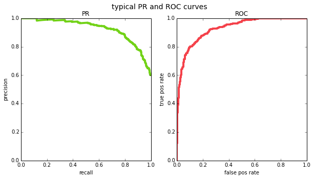
one interesting property of ROC curves is that they are monotonically increasing – if you decrease the threshold, both the number of true positives and the number of false positives cannot decrease, they can only increase or stay the same. this gives ROC curves an intuitive shape. this does not hold for PR curves because precision can go in either direction as you change the threshold. this is why PR curves sometimes look jaggedy (in fact, [1] argue that when you plot PR curves, you shouldn’t be using linear interpolation between points for the same reason – but we’ll ignore that detail for our purposes).
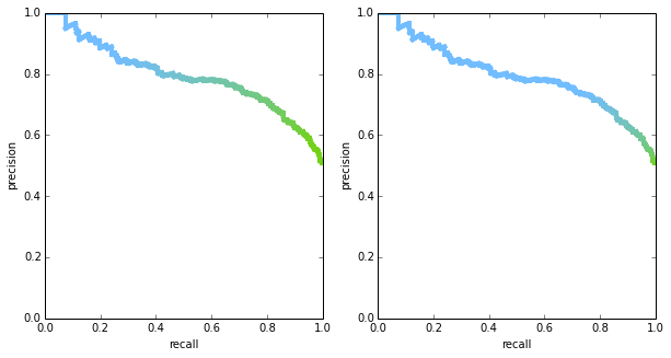
it’s important to note that both PR curves and ROC curves are plotted in 2D space, but there’s an important variable that is hidden: the threshold. in theory, we could plot both curves in 3D space if we include the threshold, or use color to encode threshold in a 2D plot. the figure below shows two PR curves with the thresholds being encoded in color – you can see that the shape of the curves is exactly the same, but thresholds are distributed differently. it is rare to see the threshold visualized in any way, though, so in most situation the two curves may be mistaken to be identical.
from matplotlib.colors import LinearSegmentedColormap

def plot_pr_color_coded(y_true, y_pred, ax):
    cm = LinearSegmentedColormap.from_list(
        colors=[GREEN, BLUE], name='green-blue')
    p, r, thrs = precision_recall_curve(y_true, y_pred)
    for idx in range(len(p)-1):
        ax.plot(r[idx:idx+2], p[idx:idx+2],
                lw=4, color=cm(thrs[idx]))
    label_plot(ax)

N = 1000
fig, axs = plt.subplots(1, 2, figsize=(10,5))

x = np.random.rand(N)
y_true = x > 0.5
noise = np.random.randn(N)*0.4

y_pred1 = x + noise
plot_pr_color_coded(y_true, y_pred1, axs[0])

y_pred2 = x + noise + 0.5
plot_pr_color_coded(y_true, y_pred2, axs[1])
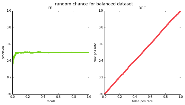
another interesting property to consider is what the curve looks like for a “random chance” classifier – knowing this would give a strawman comparison for other (hopefully smarter) classifiers. if a classifier is indeed outputting random scores, then picking points above any threshold will result in a random sample of the data. the ROC curve will form a straight line across the diagonal. this is true regardless of the prior $p$ (the probability of seeing a positive label in the ground truth). to see this, suppose we have a total of $M$ points in our dataset, and for some given threshold, $m$ of the points land above that threshold. again, the $m$ points are a random sample of the data since the scores are random. therefore:
- \(TPR = \frac{TP}{P} = \frac{m*p}{M*p} = \frac{m}{M}\), and
- \(FPR = \frac{FP}{N} = \frac{m*(1-p)}{M*(1-p)} = \frac{m}{M}\),
so TPR will be the same as FPR for all thresholds.
the PR curve, on the other hand, will look like a horizontal line because at any threshold the precision will be:
- precision = $\frac{TP}{(TP + FP)} = \frac{m*p}{m} = p$
and recall will vary across thresholds. if we try this out empirically for a balanced ($p=0.5$) and an imbalanced ($p=0.05$) datasets, we see that this is indeed the case (except due to having a finite sample of data, the PR curve ends up looking pretty jagged on the left side – this is because for very high thresholds, your m will be small and precision will jump around.
N = 10000
x = np.random.rand(N)

for prior, title in [
        (0.5, 'random chance for balanced dataset'),
        (0.05, 'random chance for imbalanced dataset')]:
    y_true = x < prior
    y_pred = np.random.rand(N)
    plot_pr_and_roc(y_true, y_pred, title=title)
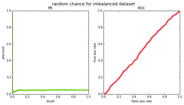
given the various differences, when should you use one metric over the other? in my opinion the main argument for PR curves over ROC is that they are more appropriate for class imbalanced datasets. if the prior in your data is tiny – i.e. almost all points are negative – then the false positive rate (x-axis in the ROC curve) has a very large number in the denominator and the false positives effectively wash out. see the example below where the prior is 0.001 and the classifier assigns high scores to all positives, but also a handful of negatives:
# imbalanced dataset and imbalanced classifier
N = 10000
y_true = np.zeros((N), np.int32)
y_true[:10] = 1  # first 10 points will be our positives
y_pred = np.random.rand(N)
y_pred[:20] += 100  # high scores for all 10 positives and 10 negatives
plot_pr_and_roc(y_true, y_pred, title='imbalanced dataset and imbalanced classifier')
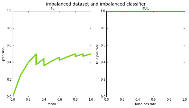
if you looked at the ROC curve, you would think the classifier is flawless; the PR curve reveals the mistakes. consider, however, an application like web search where the number of pages that are truly relevant to a query is very very small relative to the entire internet. if the classifier gave high scores to all the positive pages, but also gave high scores to a bunch of irrelevant pages, the results would be far from perfect. this is why most information retrieval benchmarks prefer PR – precision is a much more natural choice there (for an alternate explanation of this, see [3]).
another example is object detection in computer vision, where the input to the system is an image, and the output is a list of object locations (e.g. bounding boxes with an x, y, width and height). in this case, a true negative is somewhat ill-defined – e.g. if we’re analyzing the performance of a face detector, a true negative is every location in the image that is not a face. strictly speaking, there are an infinite number of locations in the image that are not a face, but even if you discretize the space of bounding boxes to align with pixels, the number of negatives is enormous. this is why object detection challenges like pascal VOC and MS COCO tend to prefer PR related metrics like mean average precision (more on this later).
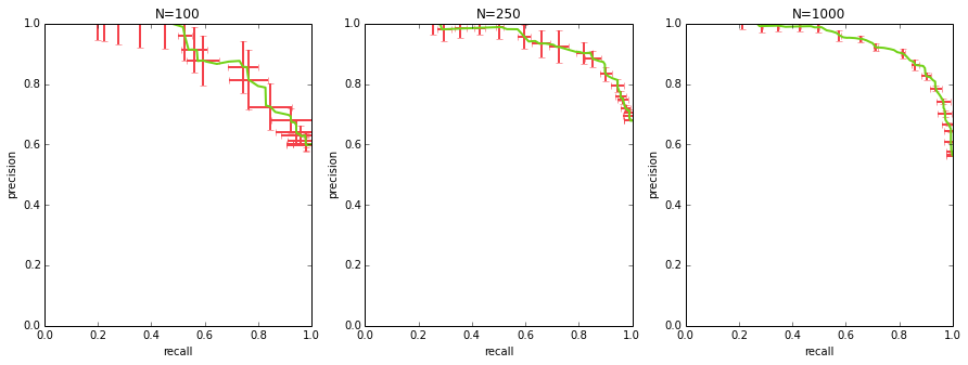
calculating a curve with error bars
when comparing multiple algorithms, oftentimes just plotting their PR curves is not enough – you want to get a sense of the uncertainty in those curves to see if the differences are statistically significant (and i’m going to be admittedly hand-wavy when i talk about statistical significance here).
to get a curve with error bars, you first need to get multiple PR curves for your algorithm. you can either do this by benchmarking a few different datasets, or you can sample your dataset with replacement and generate a curve for each sample (i.e. bootstrapping).
once you have multiple curves, how do you average them and compute error bars / standard deviation bars? each of your curves will consist of (precision, recall, threshold) points, and they will not perfectly match up along any of the 3 dimensions. the way to approach this is to sample thresholds evenly (e.g. if your scores range from 0 to 1, you could take {0.0, 0.1, 0.2, … 1.0}), interpolate both precision and recall at those thresholds for each curve, and at that point you can calculate the mean precision, mean recall per each sampled threshold, as well as standard deviation.
from sklearn.utils import check_random_state, resample

# generate data
M = 1000
x_all = np.random.rand(M)
y_true_all = x_all > 0.5
y_pred_all = np.clip(x_all + np.random.randn(M)*0.2, 0, 1)

_, axs = plt.subplots(1, 3, figsize=(15,5))
for ax_idx, N in enumerate([100, 250, 1000]):
    y_true = y_true_all[:N]
    y_pred = y_pred_all[:N]
    curves = []
    for i in range(10):
        idx = resample(range(N), replace=True)
        curves.append(precision_recall_curve(
            y_true[idx], y_pred[idx]))

    sampled_thresholds = np.linspace(0.0, 1.0, 100)
    sampled_precisions = []
    sampled_recalls = []
    # assume curves is a list of (precision, recall, threshold)
    # tuples where each of those three is a numpy array
    for precision, recall, threshold in curves:
        sampled_precisions.append(
    np.interp(sampled_thresholds, threshold, precision[:-1]))
        sampled_recalls.append(
    np.interp(sampled_thresholds, threshold, recall[:-1]))

    axs[ax_idx].errorbar(
        np.mean(sampled_recalls, axis=0),
        np.mean(sampled_precisions, axis=0),
        np.std(sampled_recalls, axis=0),
        np.std(sampled_precisions, axis=0),
        color=GREEN,
        errorevery=5,
        ecolor=RED,
        lw=2)
    label_plot(axs[ax_idx])
    axs[ax_idx].set_title('N={}'.format(N))
summarizing a curve into one number
when comparing a large number of models it’s often useful to be able to summarize performance as a single measurement rather than a full curve. there are a few options that are worth mentioning:
area under the curve (AUC) a.k.a average precision (AP)
one way of summarizing a curve is to calculate the area under it. it’s easy to see that a perfect PR curve (and a perfect ROC curve) would end up with an area of 1.0. this is usually referred to as “average precision” when talking about PR, and “area under the curve” when talking about ROC. i personally don’t like these metrics, especially for PR curves, for two reasons: 1) there’s a surprising amount of nuance in implementing average precision – see section 4 of [1] and/or the section of [2] titled “average precision”, and 2) in most applications there are parts of the PR space that you really don’t care about (e.g. precision below 0.5).
as a quick aside, when the task involves several categories rather than just binary classification, you often see people talk about “mean average precision”, which literally means you calculate an average precision per category and take an average over categories. this term always makes me laugh because it’s bizarre to see the words “mean” and “average” intentionally placed next to each other.
f-scores
you can see the precise definition at https://en.wikipedia.org/wiki/F1_score, but suffice it to say that an f score combines precision and recall, and includes a parameter beta such that when beta is 1.0, the corresponding f score (often referred to as F1) is the harmonic mean. each point on the PR curve has a corresponding f score, and to boil the whole curve down to one number, one can simply find the point with the highest possible f score.
precision@k
to calculate this metric you take the k items with the highest scores from the classifier, and measure the precision for those items (e.g. if k=10 and 9 out of those 10 were classified correctly, the precision@10 would be 90%). this metric makes a lot of sense for search applications, e.g. if you are able to fit 10 search results onto a page, you would care a lot about precision@10.
ultimately, what is probably the simplest metric is to pick a target precision and find what recall it corresponds to (or vice versa).
beyond binary
concepts like “true positive” and “false negative” only make sense for binary ground truth, so how can one use precisoin and recall when dealing with a multi class dataset? the obvious thing to do is to sweep over the classes, and compute a PR curve for each one (turning that class in “positive”, and all others into “negative”); afterwards you could attempt to combine the separate curves into one metric. this could potentially warrant an entire blog post, but for now all i’ll say is that in these situations you have to be mindful about the class priors. i’ve already mentioned the “mean average precision” metric, which may be appropriate if your categories have similar likelihoods, or if you care about them an equal amount. if not, you may need to take factor class priors into the metric somehow.
many names for the same thing
the wikipedia article on “confusion matrix” [4] has a pretty awesome side bar on the right that lists all the different quantities you may ever be interested in, along with all the synonyms. i won’t bother repeating them all here, but probably the most common alternative naming scheme i run into (mostly in the medical domain) is “sensitivity & specificity”, which are the same as $TPR$ and $1-FPR$, respectively – so the same axes as ROC, but with one axis flipped.
sources
[1] Davis & Goadrich, 2006
[2] Sancho McCann, 2011
[3] SO post, 2011
[4] “Confusion Matrix”, Wikipedia