dear zappos: here’s a way you can significantly improve user experience
i bought two pairs of shoes on zappos the other day. they were both from the same manufacturer (vans), and the same size. one pair fit, the other one didn’t. this isn’t too surprising, i own shoes that range from size 9 to size 10.5, and that’s certainly not zappos’ fault – manufacturers are inconsistent. but it still makes for a frustrating online shopping experience, which makes it zappos’ problem.
let’s take a quick tangent. suppose you’re buying glasses online. you’ll need your pupillary distance (or PD as they refer to it) to get a proper fit. the way online eyewear retailers get around this issue is either giving you instructions for how to measure your PD with a ruler at home, or use a nifty trick where you take a photo of your face with a credit card on your mouth or forehead. the credit card serves as calibration (it’s an object that everyone has and it has a canonical size), and if the user then clicks on their pupils in the photo, it’s easy to calculate their PD. this is how warby parker does it. hell, there’s a freaken app for it.
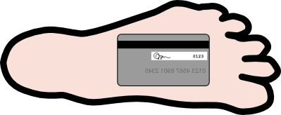
why on earth doesn’t zappos do something like this? they take the time to photograph every shoe from 25 different directions, they could just as easily measure the insides of these shoes. throw in a little interface on the web with the credit card trick, and bam, fitting problem solved. i even drew a technical schematic for them:

zappos, you’re welcome :)